Crafting a cozy and stylish living space is all about choosing the right color palette. Explore timeless color schemes that interior designers rely on to transform living rooms into stunning, personal spaces.
Choosing the Ideal Living Room Color Scheme
Think of your home’s color palette like a well-composed song—each room playing its part in creating visual harmony. The living room, being the heart of the home, is the perfect place to establish this flow. Whether you love a monochromatic look, bold contrasts, or something in between, follow these expert tips for a coordinated and beautiful color scheme.
How to Create the Perfect Color Palette: Quick Tips
- How to Create the Perfect Color Palette: Quick Tips
Use standout features like a patterned rug or artwork as a starting point. Pull colors from these elements to inspire wall paint, furniture, and accent decor.
- Match your colors to the mood you want.
Colors influence how a space feels. Cool hues like blue and green bring calm, while reds and yellows add energy. Neutrals and deep shades offer warmth and comfort.
- Stick with 3–5 core colors.
Keeping your palette focused makes coordinating decor easier and ensures a cohesive feel.
- Balance bright and neutral tones.
Use neutrals as your foundation and layer in bold hues to add personality and visual interest.
- Always test your choices in natural light.
Lighting can shift the way a color appears. Sample your fabrics and paints at various times of day to ensure they work well together in every light.
- Follow the 60-30-10 rule.
Use one main color for 60% of the space (walls, large furniture), secondary colors for 30%, and an accent shade for the final 10% to add contrast and personality.
Top Living Room Color Palette Ideas
Discover designer-favorite combinations that bring personality and polish to your space. Whether you’re drawn to earthy hues, rich jewel tones, or timeless neutrals, there’s a palette to match every style.
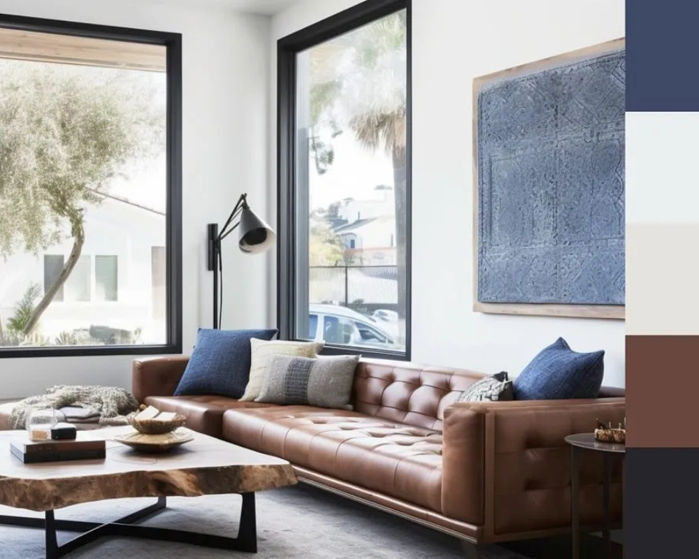
1. Warm Meets Cool: Rich Browns, Crisp Whites & Hints of Blue
Pairing warm and cool tones can result in a soothing, stylish look. Chestnut leather, warm wood, and bold cobalt accents complement a white backdrop beautifully. With neutrals dominating, the brown tones and pops of blue give depth and character to the room.
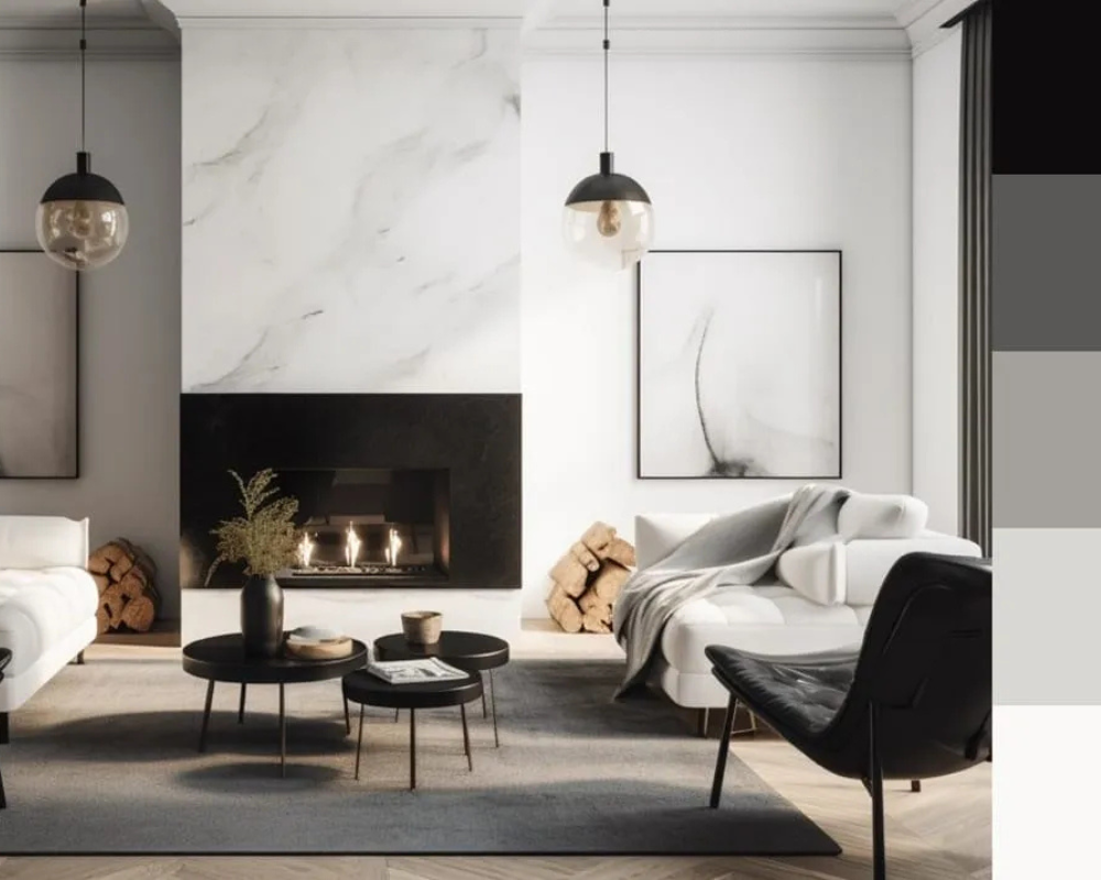
2. Refined Contrast: Marble-Inspired Monochrome
Let a statement piece like a veined marble fireplace guide your palette. Soft gray and white furnishings provide an elegant base, while black accents add contrast and definition. Small amber touches bring in a hint of warmth, balancing the cooler tones.
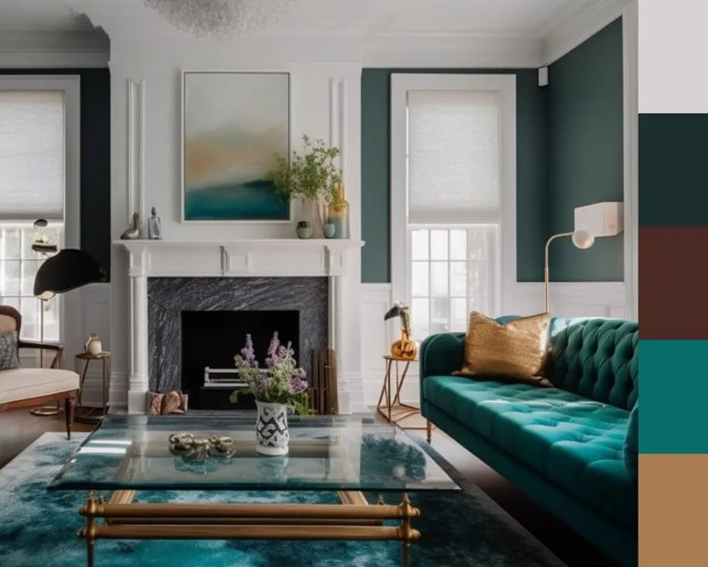
3. Luxurious Depth: Emerald and Gold Tones
For a glamorous feel, layer rich jewel tones like emerald green with whites and warm neutrals. A green sofa paired with coordinating walls creates a cohesive, opulent look. Gold and earthy details enhance the richness without overpowering the space.
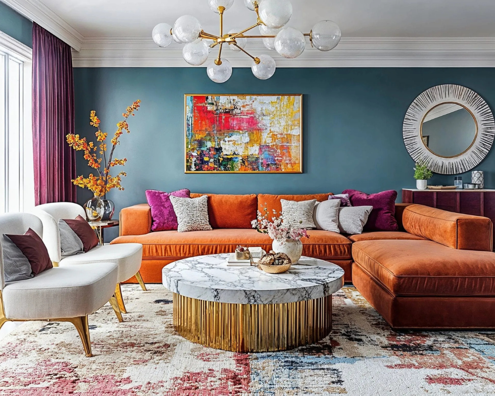
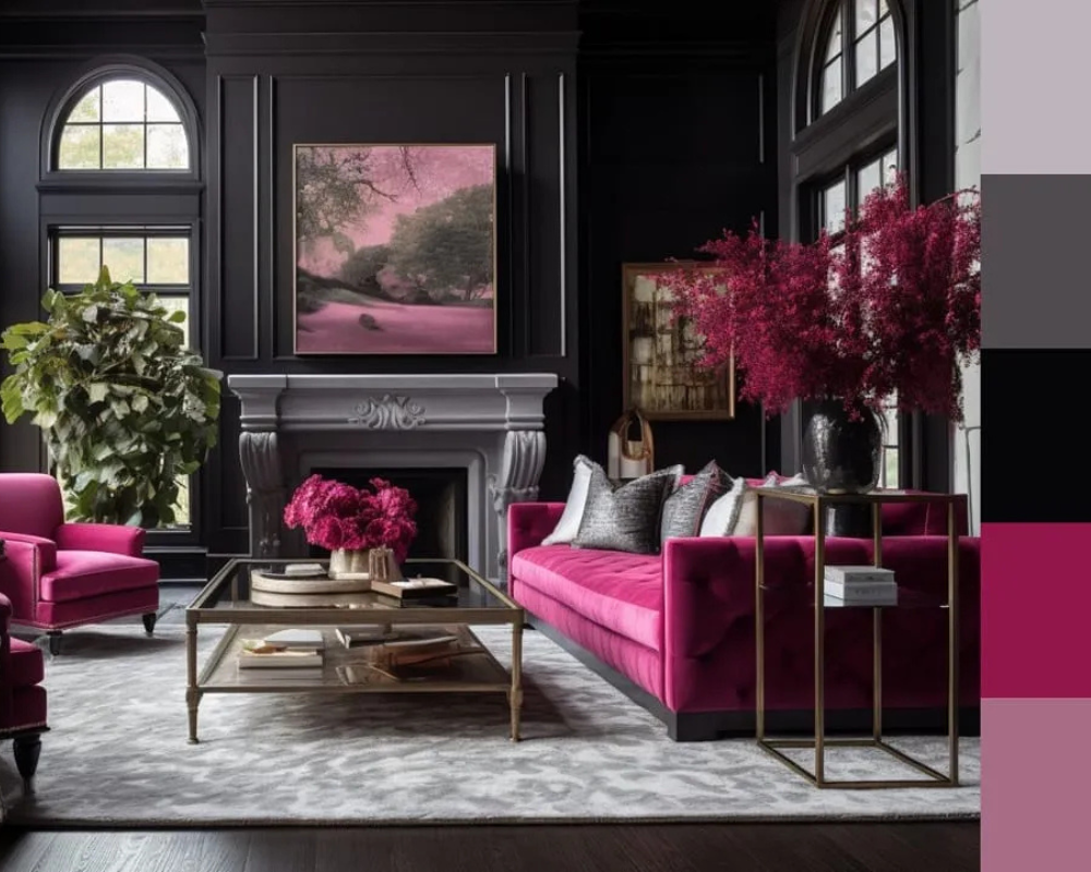
4. Striking Style: Black and Fuchsia Fusion
Looking for a bold yet balanced combination? Matte black walls bring drama, while vivid pink furniture adds vibrant energy. Soft grays in the rug and pillows calm the contrast, making the space feel dynamic yet elegant.
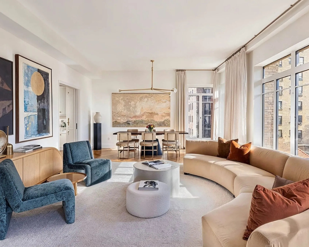
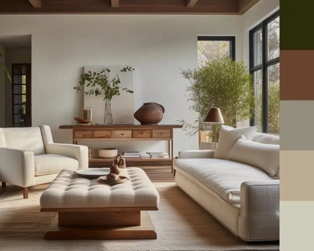
5. Soft Serenity: Layered Neutral Elegance
Creamy whites and beige tones work beautifully together to create a serene, welcoming atmosphere. Natural light enhances the cozy palette, while darker wood and textured accents provide contrast. Don’t forget a touch of green—like a houseplant—for a fresh finishing detail.